Project Overview

When I was invited to join the Chaindustry project as a UI/UX Designer, I knew this would be a challenge quite different from the usual fintech or e-commerce product. The concept was part DeFi, part task-based rewards system a hybrid of a microtask platform and a web3 investment tool designed to onboard users into the crypto space while offering real value in return. It wasn’t just a new app it was a new category, and that meant we’d be designing in a space with few best practices and even fewer familiar UX patterns. The team was made up of web3 developers, a blockchain strategist, and a product visionary who had spent years in the crypto space. I came in at the early prototyping stage, when the goal was clear: create a platform where users could invest in promising web3 projects and earn rewards by completing specific tasks things like sharing content, reviewing products, participating in community calls, or helping with micro-marketing.
The Problem
As web3 continued to evolve, many crypto startups were struggling with two major challenges: building genuine user communities and rewarding early adopters in meaningful ways. Traditional airdrops and bounty programs had proven to be hit-or-miss. They either attracted bot-driven activity or lacked the UX structure to retain real users. On the flip side, users often felt lost in technical jargon, unsure of how to participate or trust new projects. Chaindustry wanted to fix both sides of the problem. For users, the goal was to make earning crypto rewards as easy and transparent as possible. For projects, it was about gaining authentic traction, feedback, and exposure from real people doing real actions. But that vision needed a seamless and human UX layer one that could bridge the complexity of web3 with the simplicity of everyday tasks.
Research & Discovery
Our research phase started with exploring how users interacted with existing task-based or community reward platforms like Zealy, Galxe, and CoinMarketCap earn. We studied their flows, pain points, and drop-off patterns. What we found was consistent: users were often overwhelmed by disconnected platforms, unclear instructions, and opaque reward systems. We also conducted interviews with active crypto community members people who had participated in airdrops, early token sales, and community ambassador programs. Their biggest complaint wasn’t about the tech. It was about the experience. Tasks were boring. Feedback was slow or nonexistent. And many platforms lacked a sense of transparency and progress. One phrase from a user stood out to me: “It always feels like I’m doing tasks for ghosts.” That line became a guiding principle how do we make people feel like their effort matters, and that they’re doing something tangible with measurable reward?

Strategy
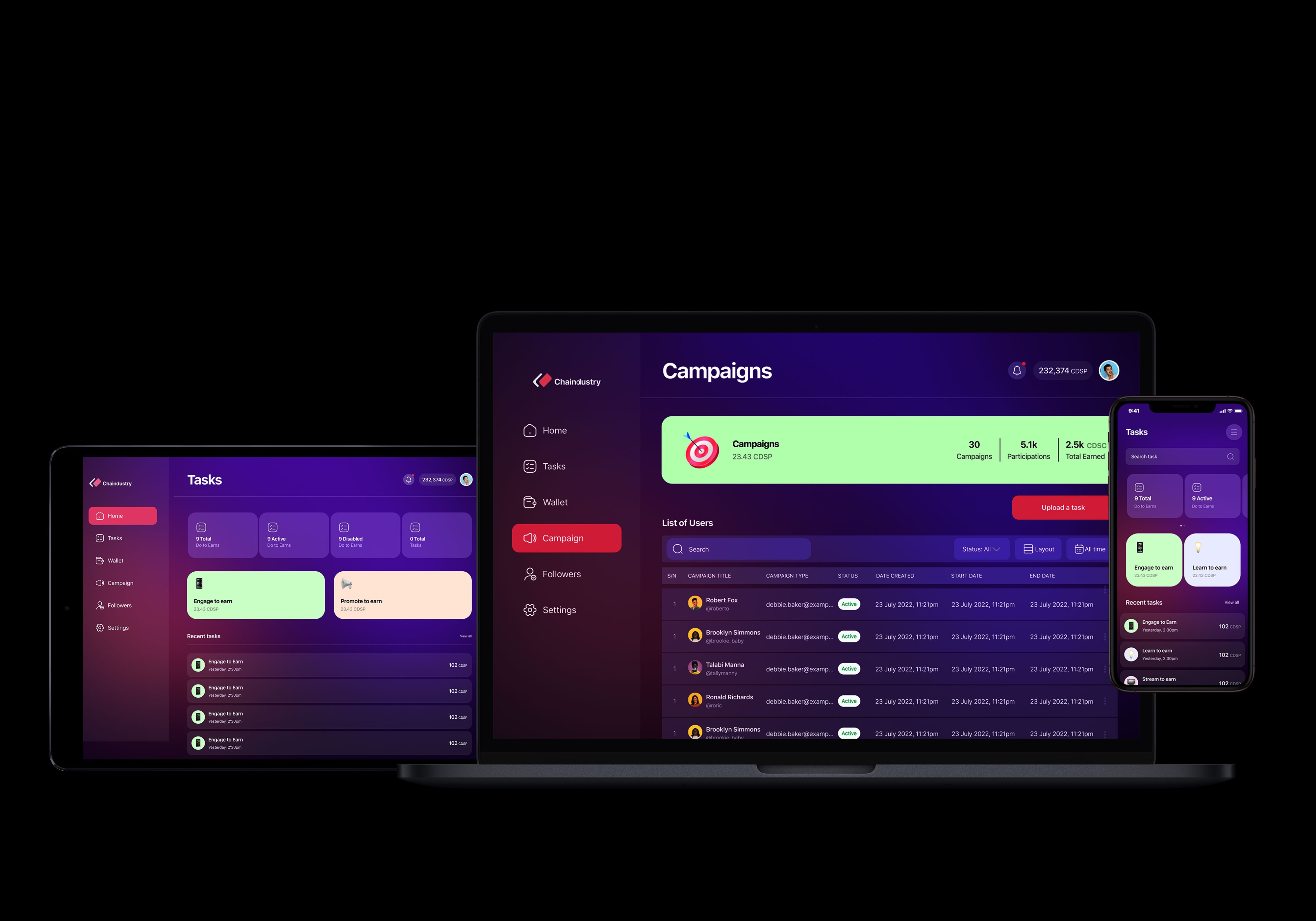
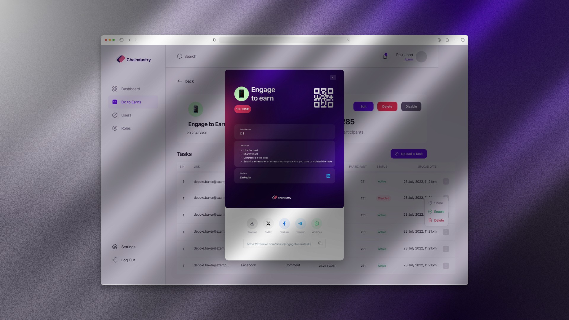
The first strategic decision we made was to design for trust and clarity above all. Web3 is already complex. The UI couldn’t afford to add to the confusion. Every screen, interaction, and prompt had to explain exactly what the user was doing, why it mattered, and how they would be rewarded.We began the wireframing process with a focus on clarity. Each task card needed to show exactly what to do, how much you’d earn, how long it would take, and where to confirm completion. Users could upload proof, sync wallets, or connect social accounts with a few taps. I designed the app around a strong visual hierarchy, using task cards, token balances, and real-time feedback to make the experience feel rewarding and goal-oriented. We also introduced a progress loop a visible tracker that showed how close a user was to unlocking their next payout or level badge, gamifying the experience without diluting its credibility.
Visit Site →
Impact
Conclusion
Because we were working in web3, collaboration between design and development was unusually tight. I had to work closely with smart contract engineers to understand how to mirror blockchain events in the UI especially for real-time reward verification. One big challenge was explaining wallet connectivity and permissions in a way that didn’t scare users off. We solved this with progressive onboarding using staged permissions, one-click Metamask syncs, and playful explanations that broke down technical steps into human language. There was also the question of trust. How do you convince people they’ll actually get rewarded? To address this, I helped design a public ledger of task completions, where users could see what others had done and what rewards were paid out bringing the transparency ethos of web3 into the core design itself. Designing for Chaindustry taught me how important it is to meet users where they are especially when working at the edge of emerging technology. It’s not enough to explain complex systems; you have to wrap them in emotion, trust, and flow.
Product Design
UX Design
Figma