Project Overview

Tranexx was built to answer a crucial need in the growing world of digital trading: connection. More specifically, the platform was designed to connect three important audiences experienced traders, learners eager to understand the market, and investors looking for verified talent. As the UI/UX Designer for this project, my role was to craft a seamless experience that would support these distinct user flows while ensuring the core of the platform trust, transparency, and mentorship remained front and center. Tranexx wasn’t just about facilitating transactions; it was about creating confidence in a space where scams and anonymity often ruled.
The Problem

The trading community is filled with talent, curiosity, and ambition. But it’s also riddled with one glaring problem: trust. Beginners find it hard to identify legitimate mentors. Investors don’t know who to trust with their funds. And genuine traders struggle to build a reputation without an ecosystem that supports proof and accountability. Without a safe, transparent, and structured way to match these users, many are left relying on screenshots, DMs, or Telegram groups vulnerable to fraud or misinformation. Tranexx wanted to create a verified space where traders could showcase their performance, learners could follow a structured path, and investors could make data-backed decisions.
Research & Discovery
In our discovery phase, we interviewed each user type separately. Beginner traders described being "overwhelmed by choices and unsure who to trust." Investors cited "skepticism due to fake profit screenshots and unverified credentials." And experienced traders expressed frustration at being lumped with scammers due to lack of formal recognition. We also performed a competitive analysis, studying platforms like Duolingo (for learning UX inspiration), eToro (social trading), and MyFxBook (performance tracking). What we discovered was that no single platform successfully connected all three roles with both education, performance proof, and communication in one place.
Strategy

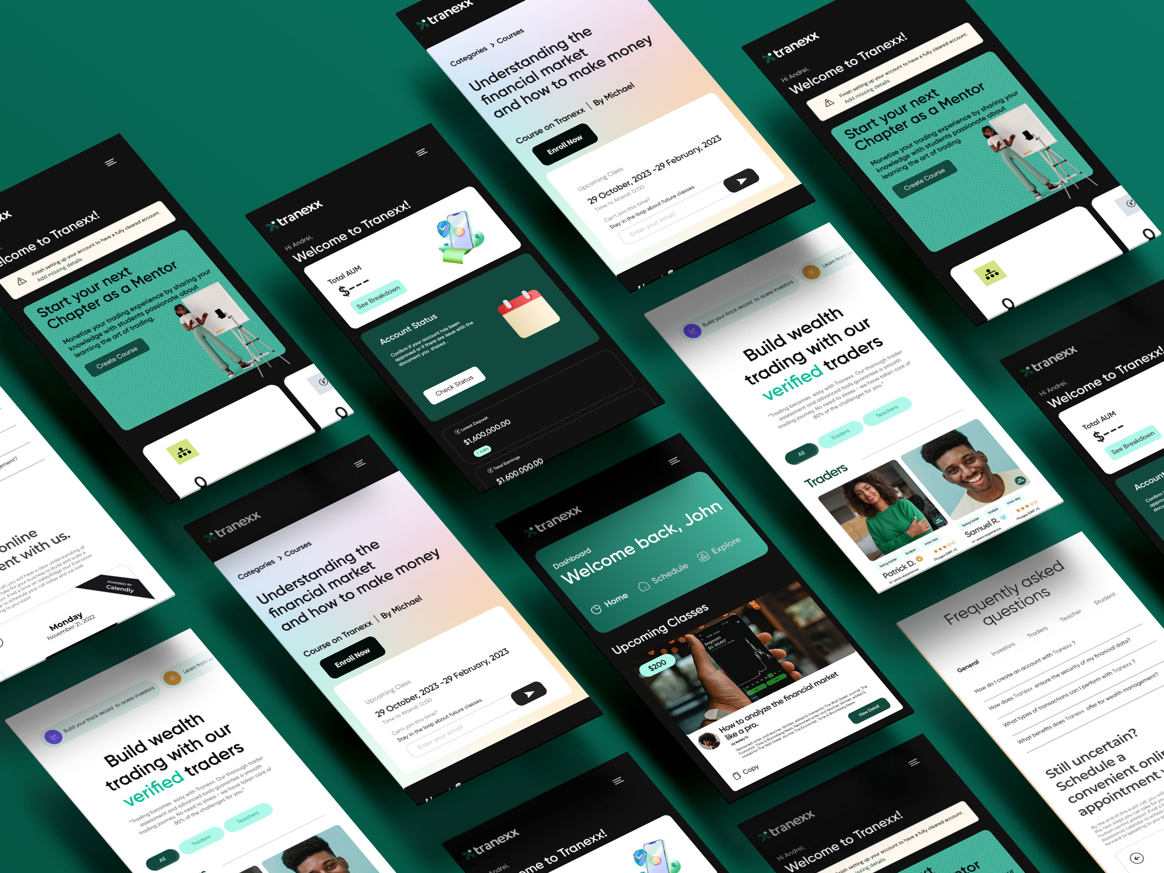
The platform needed three distinct but interconnected journeys:
A learning pathway for students to learn trading theory, tools, and strategies.
A trader profile hub that served as a transparent portfolio, including verified trades, success rates, and testimonials.
An investment matching space where investors could filter through trader profiles based on real performance and strategy compatibility.
We built low-fidelity wireframes around these flows:
Onboarding new users based on role (trader, learner, or investor)
Enabling profile creation with verification steps
Allowing learners to follow traders or mentors and track learning progress
My design strategy was centered around clarity and credibility. Everything had to feel verified, visual, and trustworthy. The layout featured a bold dashboard with modular card components for courses, trades, and connections. Each interaction reinforced user identity and purpose, making it easy to know who you were talking to and why. Based on feedback, we reduced cognitive load during signup, added a progress tracker for learners, and implemented reputation badges for traders.
Impact
Conclusion
Working with blockchain integrations posed a learning curve for both the design and dev teams. I had to collaborate closely with the backend engineers to visualize trading histories and ensure best performance. Another big challenge was designing for multi-role interaction. We had to make sure a learner could eventually become a trader, and a trader could attract both students and investors. This meant designing adaptable dashboards and modular interfaces that could grow with each user. Designing this product taught me how to balance complexity with clarity and how to build a platform that isn’t just functional, but foundational to a user’s financial journey
Product Design
UX Design
Figma